
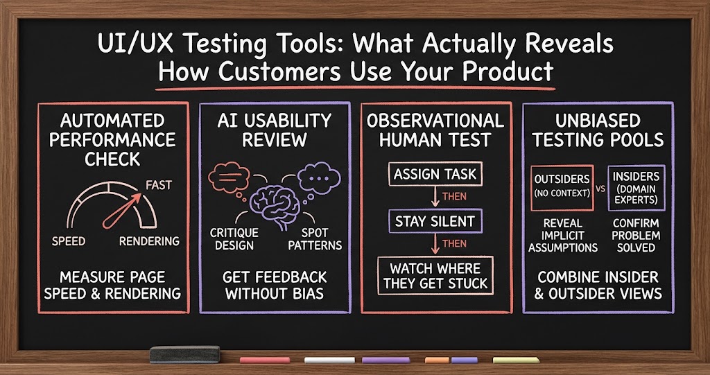
UI/UX Testing Tools: What Actually Reveals How Customers Use Your Product
Founders in a recent mastermind compared notes on testing usability, and the most useful answers weren't tools at all. They were disciplined ways of watching real people struggle with the product.

A founder running an investigative intelligence platform for law enforcement agencies asked a simple question near the end of a recent mastermind call: what tools is everyone using to test web UI for usability? His product works, technically, but he serves a wide range of users, and some of them make decisions less on whether the data returned is correct and more on how the interface looks and feels. It's a strange thing to admit in an industry built around solving hard problems, but he's right that it matters, and the answers he got back covered both ends of the spectrum: fast automated tools and slower, more revealing human ones.
Start with the free, automated layer
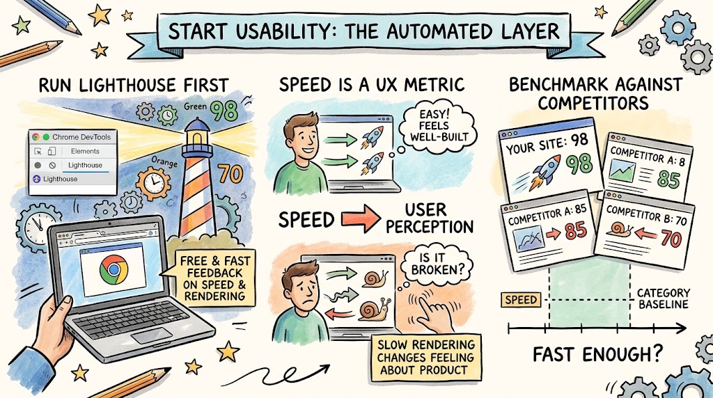
The first answers were the obvious ones, and they're worth using precisely because they're free and fast. One founder pointed straight at Chrome's built-in developer tools, specifically the Lighthouse panel, as a starting point. Lighthouse gives you real feedback on page speed and performance, and speed turns out to matter more to usability than most founders assume. How quickly things render and how fast people can actually complete an action on your site shapes their sense of whether a product feels well built, even before they consciously evaluate the design.
- Run Lighthouse before anything else. It's built into Chrome DevTools, free, and gives an immediate read on page speed and rendering performance, both of which shape perceived usability.
- Treat speed as a UX metric, not just an engineering one. Slow rendering changes how people feel about a product even when the underlying functionality is fine.
- Use it on competitors too. Running the same performance checks on other products in your space gives you a baseline for what "fast enough" looks like in your category.
Use AI as a first-pass reviewer of your own site
The second recommendation was AI-assisted analysis, and multiple founders backed it up independently. One founder described feeding his own website into an AI tool and asking it to critique the design and usability, and said the results were genuinely surprising, the kind of feedback you don't get from staring at your own product every day because you're too close to it. He runs the same analysis on competitor sites too, using AI to spot patterns in what's working elsewhere in the category. Another founder mentioned using Claude specifically for this, noting that it works well as long as you give it enough context about your product, your audience, and what you're trying to accomplish.
This came up again later in the conversation from a different angle. One founder said he uses AI as a deliberate devil's advocate, talking through his ideas with it for hours, specifically instructing it to stay neutral and counter every argument he makes. He finds this valuable because founders get excited about their own features and decisions, and a tool that pushes back on command forces sharper thinking than a team that's inclined to agree with you.
- Feed your product into an AI tool and ask for an honest critique. You're too close to your own design to see it the way a new user does, and AI doesn't have that blind spot.
- Give it real context. Vague prompts get vague feedback. Explain your audience, your product's purpose, and what specific usability question you're trying to answer.
- Use it as a standing devil's advocate, not just a one-time reviewer. Founders who talk through decisions with an AI set to push back consistently report catching weak reasoning before it becomes a shipped mistake.
The insight AI can't give you: watching a real person get stuck
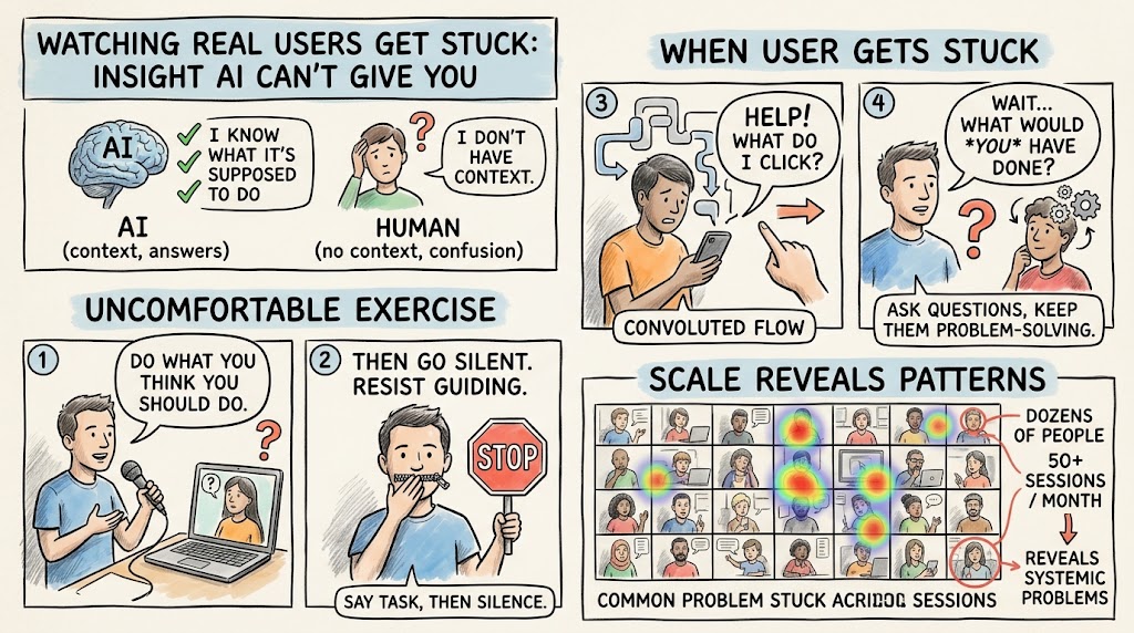
Here's where the conversation got genuinely useful, because one founder pushed back on the idea that AI-driven analysis was enough on its own. He described a simple, almost uncomfortable exercise: get someone on a call, tell them to do what they think they should do with the product, and then say nothing. Don't step in when it's tempting to. Don't hint. If they ask what to click, the answer is another question: what would you have done? He said his team ran this with fifty-six people in the space of a month, and the insights were, in his words, mind-blowing. That's not something AI can replicate, because AI already knows what your product is supposed to do. A real person who doesn't have that context will click the wrong thing, get confused by wording you thought was obvious, and abandon a flow at exactly the point where your actual customers do too.
- Say the task, then go silent. The instinct to jump in and guide someone is exactly the instinct to resist. Watching where they genuinely get stuck is the entire point.
- Ask what they would have done, don't tell them. If someone gets stuck and asks for help, respond with a question that keeps them problem-solving instead of handing them the answer.
- Run it with enough people to see patterns. A handful of sessions surfaces individual confusion. A larger sample, dozens of people, surfaces the systemic problems worth fixing first.
Recruit testers who don't understand your product at all
A related idea came from a founder who runs a marketing agency alongside his SaaS product: deliberately recruit testers who have no context on your market or your product at all, people who aren't your target audience in any sense. Watch where they click, what they understand, and what they completely misread, then use that to inform changes. His reasoning is that anyone who already understands your industry brings assumptions with them that mask real usability problems. Someone with zero context can't fill in gaps the way an informed user can, so every point of confusion shows up in sharp relief.
This isn't a replacement for testing with your actual target audience. It's a different lens on the same product, and the two together catch more than either alone. Testing with real prospects tells you whether the product solves their problem. Testing with total outsiders tells you whether the interface itself is making basic assumptions that even a smart person can't intuit without prior context.
- Recruit a small pool of people outside your target market. People with no industry context reveal interface assumptions that domain experts unconsciously fill in on their own.
- Watch for where they click versus where you expect them to click. The gap between the two is usually the clearest signal of what needs to change.
- Pair this with target-audience testing, not instead of it. Outsider testing catches interface confusion. In-audience testing catches whether the product actually solves the right problem.
Don't spare your own team
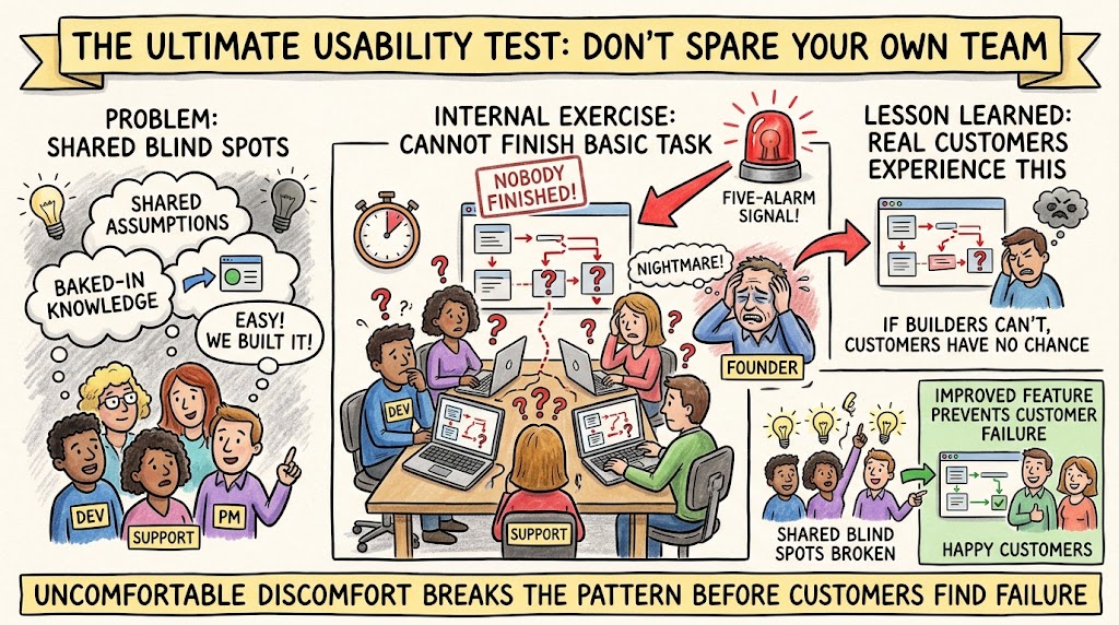
The most striking story in the whole exchange came from a founder describing an internal exercise his team ran the previous week. They took a new feature, gathered support staff, the developers who built it, and the product manager, gave everyone a task to complete using it, and nobody in the room could finish it. Not the people who built the thing. He called it a nightmare, and it was, but the point landed with everyone on the call: if the people closest to a feature, sitting right there with full knowledge of how it's supposed to work, can't complete a basic task, that's a five-alarm signal about what real customers will experience.
This is a version of the same principle as the silent-observation test, just turned inward. It's uncomfortable to run, because it means putting your own team's work in front of them and watching them fail publicly. But that discomfort is exactly why it works. Teams that build a feature together develop shared blind spots, the same assumptions baked into the design get baked into everyone's understanding of how to use it. A structured exercise like this breaks that pattern before customers find the same failure point on their own.
The real answer: layer automated tools with real humans
No single tool mentioned in this conversation is a complete answer, and that's the actual takeaway. Lighthouse and AI-assisted review are fast, free, and useful for catching obvious problems before anyone else sees them. But they can't replace watching a real, unscripted person struggle with your product in real time, whether that person is a prospective customer, a total outsider with no context, or your own team under a task they've never been asked to complete cold. The founders who get the most out of usability testing aren't the ones with the fanciest tool stack. They're the ones willing to sit quietly and watch someone get stuck, resist the urge to help, and take the discomfort of that seriously enough to actually fix what it reveals.
There's also a sequencing lesson worth pulling out of this. Run the free, automated checks first, because they're cheap and catch the obvious stuff: broken rendering, slow load times, an AI flagging an inconsistency you missed. Save the human testing for after those basics are handled, so the people you recruit are reacting to a reasonably polished product rather than tripping over problems you already knew about. And build the habit of running some version of this on a regular cadence, not just before a big launch. Usability erodes quietly as a product grows more features and more edge cases, and the founders who catch that early are the ones still testing months after everyone else assumed the interface was done.