The Lead Magnet Mistake Killing Your Homepage
Most SaaS homepages still lean on the old lead-magnet playbook, a form full of fields standing between a visitor and your product. Here's why that habit is quietly costing you signups, and what to put there instead.

A few weeks ago in our mastermind, a founder pulled up his own homepage and did something most of us never bother to do: he scrolled through it on his phone, pretending to be a stranger seeing it for the first time. What he found was a lead magnet form sitting front and center, five fields deep, right where his "start free trial" button should have been the whole time. He had inherited the form from an old mastermind playbook that said every SaaS homepage needs one. Staring at it as a first-time visitor, he realized it wasn't capturing leads so much as getting in the way of them.
This is a more common problem than most founders realize, and it's worth understanding why the old advice stopped working. Lead magnets, the free guide, the checklist, the "first page of this report" trade, were built for a world where a visitor's email address was genuinely hard to get and worth a real exchange of value. That world has changed. Inboxes are flooded, AI has made it trivial to generate content that used to feel like a valuable download, and buyers have gotten a lot more skeptical about handing over their information for something vague.
Why the old lead magnet stopped converting
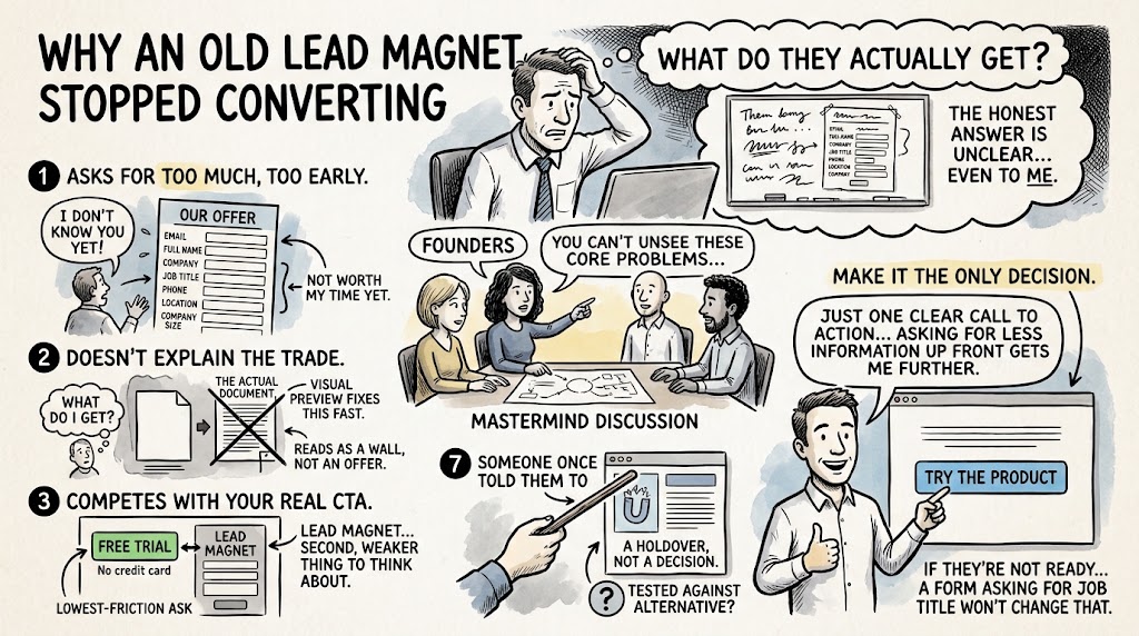
Ask yourself what a visitor actually gets when they fill out one of these forms, and you'll often find the honest answer is unclear even to you. In the mastermind discussion, other founders pointed out the same core problems with a typical homepage lead magnet, and once you see them, they're hard to unsee.
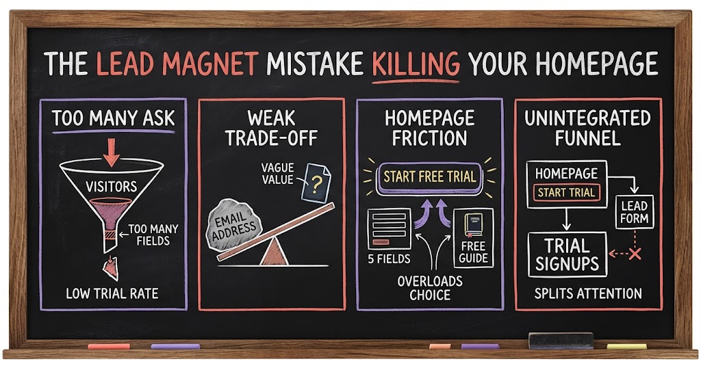
- It asks for too much, too early. Five form fields, including things like company name or location that you could figure out later, is a lot to ask from someone who hasn't decided you're worth their time yet.
- It doesn't explain the trade. If a visitor can't tell at a glance what they get in exchange for their email, the form reads as a wall, not an offer. A one-line teaser or a visual preview of the actual document fixes this fast.
- It competes with your real call to action. If you're running a no-credit-card free trial, that's already the lowest-friction ask you can make. A lead magnet sitting next to it just gives visitors a second, weaker thing to think about.
- It's a holdover, not a decision. A lot of founders add a lead magnet because someone once told them to, not because they tested it against the alternative. That's worth catching.
One founder in the group put it simply: he doesn't use any lead magnet on his homepage at all, just one clear call to action, and he's found that asking for less information up front gets him further. If a visitor is ready to try the product, make that the only decision on the page. If they're not ready yet, a form asking for their job title isn't going to change that.
Where lead magnets still earn their place
None of this means lead magnets are dead. The distinction that came out of the discussion is about placement, not the tactic itself. A lead magnet works when it's the entire point of the page, not a distraction competing with your main offer.
- Dedicated landing pages for paid traffic. If you're running retargeting ads or a specific campaign, a standalone page built just for that lead magnet can convert well, because there's no competing call to action pulling attention away.
- Deeper forms belong on their own page. A homepage callout bar should ask for two fields at most. A full landing page built around the offer can reasonably ask for more, because the visitor has already opted into that exchange.
- Testing on paid channels first. Before you commit a lead magnet to permanent real estate on your homepage, try it as a landing page for a slice of your ad spend and see if it actually performs.
The homepage itself is a different job. Its only goal is getting the right visitor to take the one action that matters most, and for most SaaS products with a free trial, that's starting the trial. One example that came up in the discussion was a company that stripped its entire homepage down to sign up free, log in, and a short explanation of how the product works, nothing else. Their dedicated landing page for paid ads goes even further: it removes the navigation, the product explainer, everything except login and sign up. The visitor can either exit the page or take the one action you want them to take. Nothing else competes for their attention.
What to actually put on your homepage instead
If you're staring at your own homepage wondering whether that lead magnet earns its spot, the test is simple: does it help the visitor who is ready to try your product move faster, or does it slow them down while you collect information you don't urgently need? For most SaaS companies with a real free trial, especially one that doesn't require a credit card, the answer points toward simplicity.
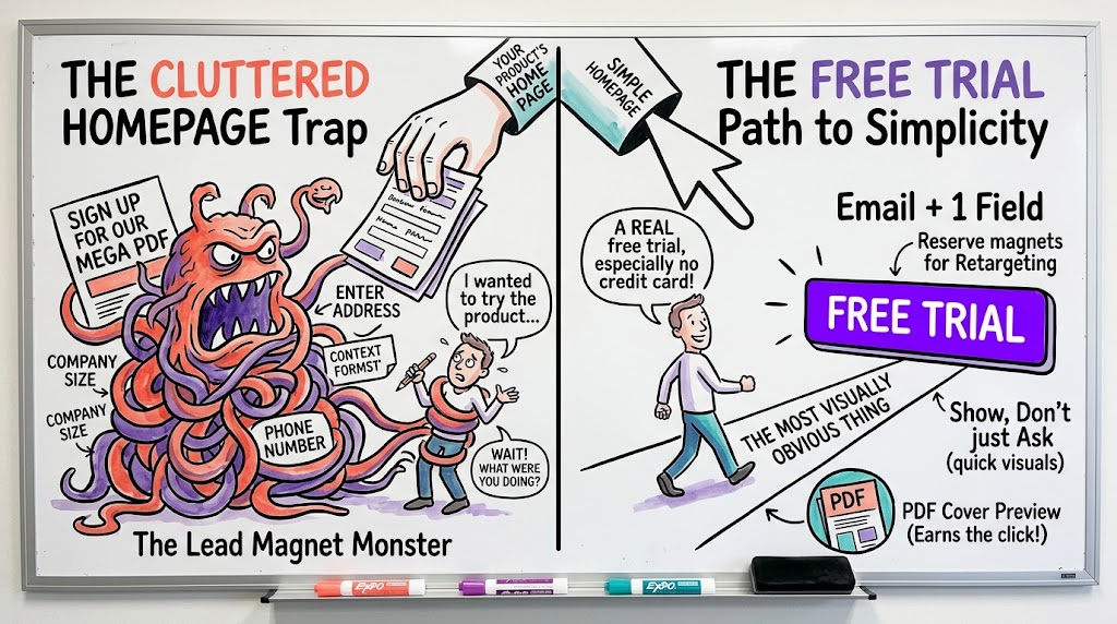
- Lead with the free trial. Make it the most visually obvious thing on the page. Everything else on the homepage should support that decision, not distract from it.
- Cut form fields to the bare minimum. Email and maybe one qualifying field is usually plenty for a homepage callout. Anything more belongs on a dedicated page, if it belongs anywhere at all.
- Reserve the lead magnet for paid and retargeting traffic. That's where a visitor has already shown intent and a slower-conversion offer makes sense.
- Show, don't just ask. If you do keep any kind of opt-in on the homepage, a quick visual, a preview image, a cover of the actual PDF, does more to earn the click than another paragraph of text.
The founder who brought this up ended the conversation planning to drop the lead magnet form from his homepage entirely and let the free trial button do the job on its own. That's often the right call. Most SaaS products with a genuinely low-friction trial don't need a middle step, and every extra field or competing button on the homepage is one more place a ready buyer can second-guess themselves.
The bigger lesson: audit your own funnel like a stranger
What made this whole conversation useful wasn't really about lead magnets specifically. It was the exercise that surfaced the problem in the first place: opening your own site on your phone and pretending you've never seen it before. Most founders build their homepage once, tweak it occasionally, and then stop looking at it with fresh eyes. The friction accumulates quietly, a leftover form here, an outdated call to action there, until the page is doing a worse job than it should.
Set a reminder to do this walkthrough every quarter. Pull up your homepage on your phone, pretend you're a visitor who has never heard of your company, and ask what's actually being asked of you at each step. If you can't answer clearly why a form field, a section, or a secondary call to action is there, that's usually a sign it's earned its place out of habit rather than results. The fix is rarely complicated. It's almost always about removing something, not adding it.
How to make the change without flying blind
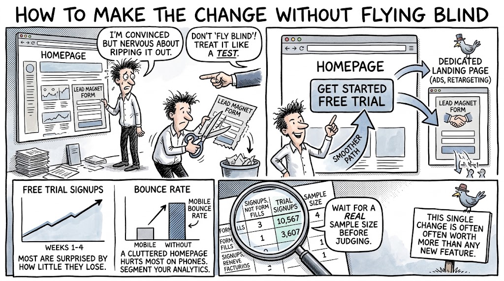
If you're convinced but nervous about ripping out something that's been on your homepage for years, you don't have to make the change all at once. Treat it like any other conversion test. Cut the lead magnet form from your homepage, watch your free trial signups and your overall traffic-to-signup rate for two to four weeks, and compare it to your baseline. Most founders who make this change are surprised by how little they lose from the people who were actually filling out that form, and by how much smoother the path to the trial button suddenly feels.
- Track signups, not form fills. A lead magnet form fill was never the real goal. If removing it doesn't hurt your trial signup number, you have your answer.
- Watch bounce rate on mobile specifically. Since most SaaS signups now happen on a phone, that's where a cluttered homepage does the most damage. Segment your analytics accordingly.
- Give it a real sample size before judging. Two weeks of data on a low-traffic homepage can be noisy. Wait for a large enough sample before deciding the test won.
And if you do want to keep a lead magnet somewhere in your funnel, remember that it doesn't have to live on the homepage to do its job. Move it to a dedicated landing page for your ads, your retargeting campaigns, or a specific piece of content you're promoting, and let your homepage go back to doing one thing well. That single change, simplifying the page that gets the most traffic and the most scrutiny, is often worth more than any new feature you could ship that quarter.