
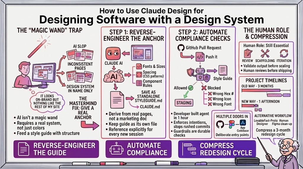
How to Use Claude Design for Designing Software with a Design System
Why Claude Design produces inconsistent pages without a real style guide behind it, and how founders are getting consistency by reverse-engineering a guide from their existing product and wiring it into CLAUDE.md, with automated checks that block off-brand code before it ships.

Anthropic shipped Claude Design back in April, and in the months since, I've watched founders in our mastermind try it in every configuration you can imagine: pointing it at an existing app, feeding it a brand PDF, wiring it into Figma, letting it loose on a blank page. The tool is genuinely good. But the honest answer to "does it just work" is no, not out of the box, and the founders getting real value out of it are the ones who treat it less like a magic wand and more like a new hire who needs a clear onboarding document.
That came up in a recent mastermind call when one of our members described exactly the wall most people hit. She had just lost her in-house designer and was trying to keep shipping pages without one. Her old process was to build a Figma file, hand it to a designer, and wait. That workflow was too slow for a solo operator, so she tried Claude Design to prototype a page herself. The result technically worked. It used the right colors and the right font. But it looked nothing like the rest of her site, and every new page she generated after that looked slightly different from the last one. She had a design system in name only. In practice, she had a pile of one-off pages that happened to share a color palette.
The problem is almost never the model
When I hear a story like that, my first instinct isn't that the AI failed. It's that the AI was never actually given a system to follow. A brand PDF tells Claude what your colors and fonts are supposed to be, but it says nothing about how your header spacing works, how your buttons behave on hover, or how a card component should look when it's got three lines of text instead of one. Feed the model a style guide without that context and you'll get what one member on the call called "AI slop": on-brand colors wrapped around a structure that has nothing to do with your actual product.
Another member on the call, who has spent months making Claude Design work for a production SaaS product, described the fix plainly. Point Claude at your existing application and ask it to reverse-engineer a style guide from what's already there. It will go through your real pages and tell you which fonts you're using, which sizes, which spacing, which CSS patterns repeat. You review that output, correct anything it got wrong, and now you have a document Claude actually derived from your product instead of a marketing PDF that was never meant to double as engineering spec. Save that as its own markdown file, then make sure your CLAUDE.md file references it directly. From there, every new page Claude builds pulls from the same source of truth, and when you want to change a rule, you change it once in the style guide instead of re-explaining it in every prompt.
- Reverse-engineer before you generate. Ask Claude to read your existing app and extract the fonts, sizes, and spacing you're actually using, rather than starting from a static brand document.
- Give the style guide its own file. Keep it as a standalone markdown document, not buried in a prompt, so it can be updated without touching anything else.
- Reference it explicitly. Point your CLAUDE.md at that file so every session, every new page, and every teammate's session pulls from the same rules.
- Validate before you scale it. Check the output against the real guide the first few times. Once you trust it, you can hand off larger batches of pages with confidence.
Design in a sandbox, then hand off a clean file
Not every team wants Claude generating production pages directly. One member described a workflow that splits the difference nicely. His product team designs pages inside Lovable first, working fast and rough, then sends the result to a human designer who cleans it up into a proper Figma file overnight. The designer never has to sit through an explanation of what the team wants. He just opens the Lovable link, sees the intent, and executes against an established design language: the same colors, the same font weights, the same visual hierarchy every time. What used to require a meeting and a set of written requirements now takes a link and a few hours.
The pattern underneath both of these approaches is the same. AI is genuinely excellent at generating a lot of pages fast, but it is not naturally consistent unless you give it something consistent to copy from. The teams getting good results have all built some kind of anchor, whether that's a style guide file, a working prototype in a design tool, or an existing production app, and they force every new page to reference that anchor instead of reinventing the wheel each time.
- Rough draft first, polish second. Let AI generate a fast, imperfect first pass rather than waiting for a perfect prompt.
- Hand off intent, not instructions. A working prototype communicates what you want far faster than a written brief.
- Keep one person accountable for consistency. A single designer or reviewer applying the same standard catches drift a generator alone won't.
- Save the overnight cycle for polish. Use the gap between sessions to clean up details, not to redo the underlying structure.
Automate the guardrails, not just the generation
One of the more clever ideas shared on the call came from a member whose developer built an agent that checks every code push to GitHub against the team's style guide before it's allowed through. If a pull request uses the wrong hex code, the wrong icon, or a font that doesn't match the approved set, it gets flagged and blocked before it ever reaches staging. The developer built this in about an hour, sitting in the layer between the local push and the CI/CD pipeline. It doesn't matter how disciplined your prompts are if a rushed change from a contractor or a tired 11 p.m. commit slips a random color into production. A style guide is a set of intentions. An automated check is what actually enforces them.
This is worth sitting with, because it points at where AI-assisted design work is actually heading. The interesting problem isn't generating a page anymore, that part is close to solved. The interesting problem is making sure a hundred AI-generated pages, built by different people over different weeks, still look like they came from the same company. Automated compliance checks in your pipeline are a cheap, durable way to guarantee that without relying on everyone remembering the rules.
- Put the check between local and staging. Catch violations before they reach a shared environment, not after.
- Flag on color, font, and icon deviations. These are the three things that drift fastest across a growing set of AI-generated pages.
- Block the push, don't just warn. A warning gets ignored under deadline pressure. A blocked push forces the fix.
- Build it once, let it run forever. This kind of agent is cheap to build and keeps paying off long after the initial setup.
Where a human designer still earns their keep
None of the founders on this call had fully replaced their designer. The Lovable-to-Figma workflow still ends with a human. The style guide approach still gets reviewed by a person before it ships. What's changed is how much of the raw production work AI can carry before a human needs to touch it. A three-month project to stand up a small set of pages, which is the timeline one member described from her old process, can now compress into a redesign ticket that takes thirty minutes to prototype and a pull request the same afternoon.
There's also a workflow question worth thinking through before you scale any of this: local machine or a dedicated environment. One member was running redesign tickets from a local setup, pulling from Jira, generating a preview, and opening a pull request, and was wondering whether to let an agent run unattended on a separate machine while she was out. The advice from the group was sensible. Don't automate the loop until the loop is actually producing the results you want by hand. Get your style guide, your prompting pattern, and your review process dialed in first. Only after that is solid does it make sense to wire Claude into your ticketing system and let it stub out branches on its own, with a human review gate before anything goes live.
- Dial in the loop by hand first. Get your style guide, prompts, and review process working before you automate any part of it.
- Then wire it into your ticketing system. Once results are reliable, connect Claude to Jira or a similar tool so it can pull tickets directly.
- Stub branches, don't push live. Let the automation create a branch and a pull request, and keep a human review gate before deploy.
- Treat unattended runs as a later milestone. Running while you're away is the reward for a dialed-in process, not a shortcut to one.
Multiple doors into the same system
It's worth knowing that a reverse-engineered style guide is only one way in. Claude Design can also build a design system by connecting directly to Figma, pulling from a GitHub repository, working from uploaded brand assets, or running entirely through Claude Code against your codebase. The right entry point depends on where your source of truth already lives. A team with a mature Figma library should probably connect that library directly rather than asking Claude to guess at conventions from screenshots. A team with no design tool at all, just a working product, is better off with the reverse-engineering approach described above. What matters isn't which door you walk through. It's that you walk through one deliberately instead of letting Claude start from nothing.
It's also worth being honest that this takes real iteration, not a single prompt. The founders getting consistent UI and UX out of Claude Design are the ones who kept working at it over weeks, refining the style guide as they noticed gaps and tightening the CLAUDE.md references. Newer model versions have made this meaningfully easier too, so if you tried Claude Design early on and got inconsistent results, it's worth another look now.
- Match the entry point to your source of truth. Connect Figma if that's where your real design lives, reverse-engineer your app if it doesn't.
- Don't expect one prompt to finish the job. Consistency comes from weeks of refinement, not a single well-worded request.
- Revisit tools you tried early on. Newer model versions handle long, consistent design systems noticeably better than earlier ones did.
- Keep the style guide alive. Update it as you notice gaps instead of treating it as a one-time setup task.
The takeaway
If you're getting inconsistent results out of Claude Design, the fix probably isn't a better prompt. It's giving the model a real anchor to work from: a style guide it reverse-engineered from your actual product, referenced explicitly in your project configuration, checked automatically before code ships, and reviewed by a human until you trust the loop enough to let it run further on its own. Get that scaffolding in place and you can genuinely compress a three-month design project into an afternoon. Skip it, and you'll keep generating pages that are on-brand in isolation and disjointed as a set.
- Start with the style guide, not the pages. Every other improvement compounds once Claude has a real anchor to reference.
- Automate enforcement, not just generation. A guardrail agent catches drift that no amount of careful prompting will.
- Let AI absorb the volume, not the judgment. Keep a human making the final call on anything that ships.
- Revisit the tooling as models improve. What felt inconsistent six months ago may already be solved with a newer model.