
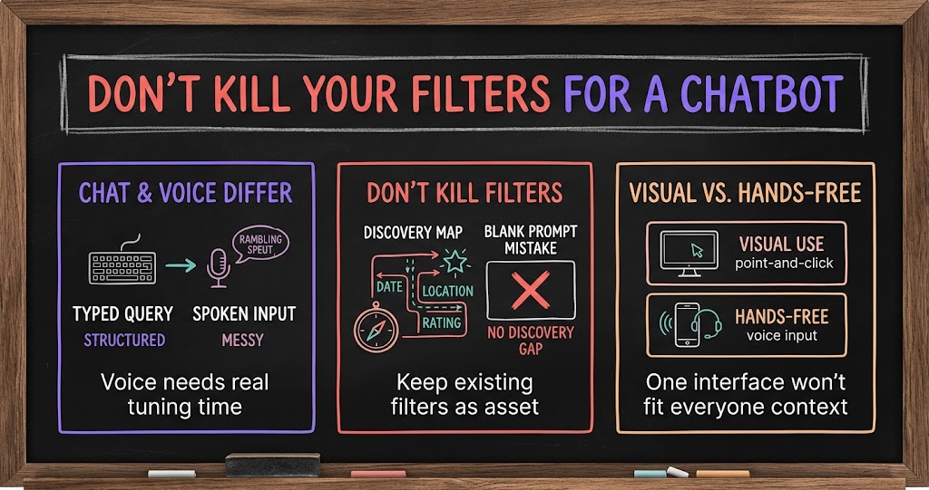
Don't Kill Your Filters for a Chatbot
A mastermind discussion on redesigning SaaS UIs around AI and voice reveals a costly mistake some big players are making: ditching filters and views for a blank chat box, and why keeping both wins.

One of our members has been running a review-management SaaS for a while now. The code base goes back fourteen years, and the current version has been sitting on Bootstrap 4 for the last five. It works, it has a public reviews view where you can filter by rating range, by location group, by date, and then click into whatever needs a response. But he's staring down a major UI upgrade, and like a lot of founders right now, he's asking the obvious question: do I rebuild this around AI and voice, or do I just modernize the same basic interface? He brought it to the group looking for honest answers. What's actually working out there, what's fantasy, and what's just hype.
Chat and voice are not the same product decision
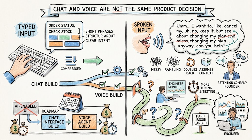
The first thing that came out of the discussion is a distinction a lot of founders blur together: adding a chat interface and adding a voice interface are two very different projects, even if they look similar on a roadmap slide. One founder running a retention-software company pointed out that his team deployed an interactive voice agent earlier this year, and the lesson landed hard. People do not talk the way they type. A typed query tends to be short and structured, almost like a search term. A spoken request rambles, doubles back, and assumes context the system doesn't have. Getting voice to work as reliably as chat took a lot more testing and monitoring than the team expected going in.
- Typed input is compressed. Users type like they're searching, short phrases, clear intent.
- Spoken input is messy. Users talk like they're thinking out loud, with false starts and extra context.
- Voice needs more tuning. Getting a voice agent as reliable as a chat interface takes real testing time.
- They're separate roadmap items. Treat chat and voice as two builds with different risk profiles, not one feature.
That matters for planning purposes alone. If you're budgeting a quarter for "AI-enabled UI," you're really budgeting for two different problems that happen to share a chat window.
The filter mistake almost everyone is making
Here's the part of the conversation that's worth slowing down on. The founder with the voice agent made an observation about the direction a lot of major software players have taken with their AI interfaces: they've abandoned the filter concept entirely. No more saved views, no more lenses into the data, just a blank text box waiting for you to type something. His read on that is that it's genuinely frustrating for users, and it especially hurts new users who don't yet know what the product can even do. He compared it to staring at a blank page in an old word processor. That kind of interface was notoriously bad, and it only got better once you could actually see the things you were capable of doing.
- A blank box has no discoverability. New users can't tell what's possible if there's nothing to look at.
- Filters act as a map. Saved views and lenses show a first-time user the shape of what the product does.
- This isn't a minor detail. Several major platforms have made this exact swap, and it shows up as a real complaint.
- The comparison holds up. A blank prompt with no visible options is the same failure mode as a blank word processor page.
So what did his team actually do differently? They kept every filter, view, and saved lens they already had, and layered natural language on top instead of replacing the old interface with it. A user can still click through the existing filters exactly like before, or they can now describe what they want in plain language, and the system translates that request into the same backend logic that already powers the filters. Nothing got removed. Something got added on top.
The result, in his words: no pushback at all, and utilization actually went up. That's the outcome you want to hear before you rip out a working interface. Adding a capability increased usage. Removing a capability to make room for a shinier one would almost certainly have done the opposite.
Where in the product does this even belong
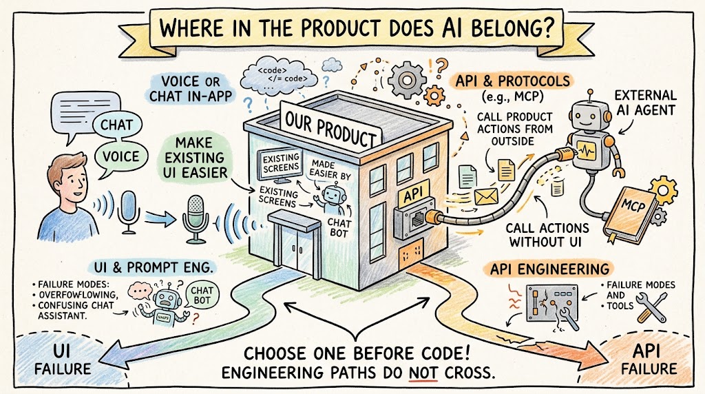
Partway through, another founder, who builds AI agent software, asked a clarifying question that's worth stealing for your own planning conversations: are we talking about voice versus chat inside your existing app, or are we talking about exposing your app's functionality to other systems entirely, the kind of thing people now build with protocols like MCP so an AI agent somewhere else can call your product's actions without a human ever opening your UI? Those are genuinely different problems, and conflating them is a good way to scope a project badly. One is a UI and prompt-translation problem, about making your existing screens easier to use by typing or talking to them. The other is an API and protocol problem, about making your product's actions callable by outside tools and agents, and the two barely share any of the same engineering work.
The founder running the review-management SaaS confirmed he's already wrapping a lot of his APIs for that kind of external access, but said that's a separate conversation from what he was asking about. His question was specifically about the desktop interface people actually sit in front of. That's a useful discipline to borrow: know which of the two problems you're solving before you start writing code, because the tools and the failure modes are not the same.
Different users will want different interfaces, permanently
A founder in the oil and gas software space shared how his team thought through this exact tradeoff internally, and his conclusion was refreshingly non-dogmatic. He doesn't think the traditional graphic interface is going away, and he doesn't think everyone is going to switch to voice either. His team expects a split: some users, particularly desktop users, will keep preferring a visual, point-and-click interface, while mobile users are moving toward hands-free interaction, especially for step-by-step tasks where looking at a screen isn't practical. They've already seen mobile users start replying to prompts and receiving instructions purely by voice, with no graphic element involved at all.
- Desktop users tend to stay visual. Point-and-click interfaces still suit people sitting at a screen with two hands free.
- Mobile users are moving hands-free. Step-by-step tasks on a phone favor voice when your hands or eyes are busy elsewhere.
- Chat sits in between. His team also added chat across all their mobile apps as a middle option for people who don't want either extreme.
- One interface won't fit everyone. The plan is to support all three rather than betting the whole product on one.
That framing reframes the whole debate. This isn't really a question of which interface wins. It's a question of which interface wins for which user, in which context, doing which task, and the honest answer is that the segments split by device and by moment, not by generation or by product category.
Guided onboarding might matter more than the chat box itself
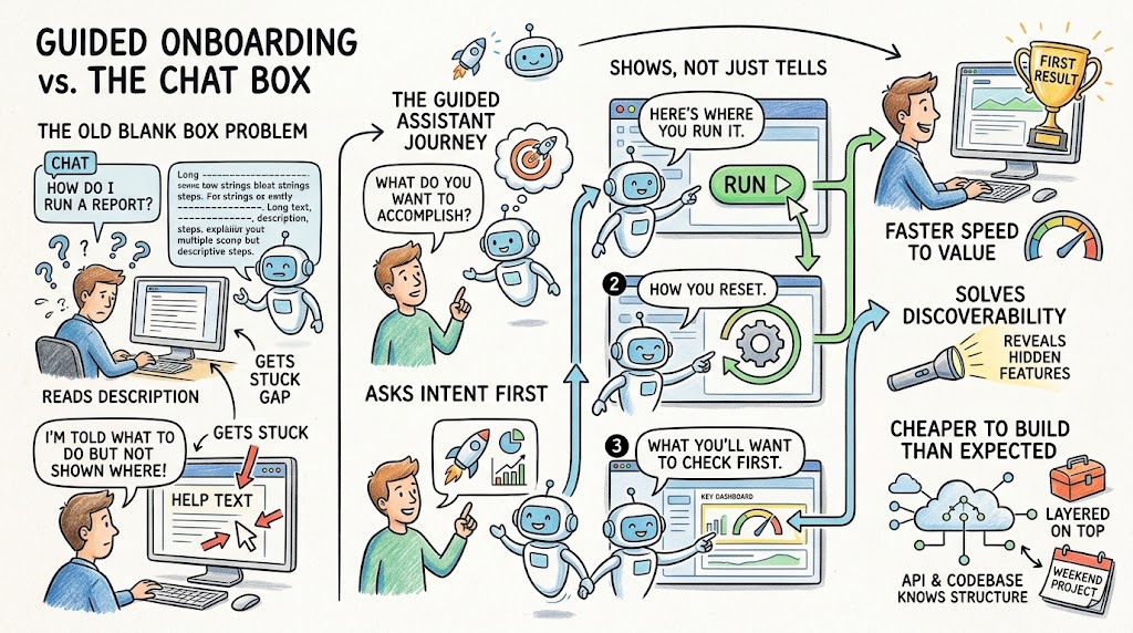
The most concrete demo in the conversation had nothing to do with voice. One member showed a guided-tour assistant he'd built that walks a new user through the product based on what they say they're trying to do. During onboarding, it asks what use case brought them in, then shows them around the relevant parts of the app: here's where you run it, here's how you reset it, here's what you'll want to check first. It's built for people who are still visual thinkers and want to see the product, not just read about it or ask it questions. He mentioned it was built as a weekend project, and pointed out that if your product already has an API and your codebase already knows where everything lives, layering a guided assistant like this on top is a lot less work than it sounds like.
- It asks intent first. The assistant starts by learning what the user actually wants to accomplish.
- Then it shows, not just tells. It walks the user to the relevant screen instead of just describing where to click.
- It solves the same discoverability gap. It's a direct answer to the blank-box problem, but built into onboarding rather than search.
- It's cheaper to build than expected. A codebase that already knows its own structure and API surface can support this fairly quickly.
The founder with the review-management product said this landed for him personally. He'd recently gotten stuck on some help text that told him what to do but never showed him where to actually do it, and he saw immediately how a guided assistant like this closes that exact gap. It's a small feature with an outsized effect on how fast a new user gets to their first real result.
Should you still use a UI template, or just generate it
The last thread worth pulling on came from a practical question: with AI code generation as good as it is now, should you keep licensing a third-party UI template, or just generate the interface directly? One founder who's moved past templates said the core problem was always synchronization. You download a template, build your product on top of it, and then the template vendor keeps updating their version while you keep updating yours, and keeping the two in sync turns into a permanent maintenance tax that never really justified itself. Generating the interface directly gets rid of that dependency altogether, since you're no longer tracking someone else's release schedule against your own, and the speed gap that used to make templates worth the setup convenience has mostly closed. It comes down to a straightforward build-versus-license call: weigh the ongoing tax of keeping two codebases in sync against the time a template saves you on day one.
None of this means you need to throw out a working interface tomorrow. The bigger lesson from the whole conversation is to treat the filters, views, and saved lenses you've already built as an asset, not legacy debt to be replaced by a chat box. Add language on top. Add a guided assistant for the people who want to be shown, not told. Keep the visual interface for the people who want it, and build hands-free paths for the people who genuinely need them. The founders getting this right aren't picking one interface and forcing everyone through it. They're layering new ways in without taking any of the old ones away.