
How to Fix Your Ad Creatives
A no-nonsense look at why most B2B ads underperform, and how to simplify messaging, clarify audience targeting, and refresh creative so your ads earn clicks, stay relevant, and scale without fatigue.

Most SaaS teams think they have an ad performance problem when what they really have is a creative problem.
The targeting is fine. The budget is fine. The channels are fine. But the ads themselves aren’t doing their job. They’re either too complicated, too generic, or trying to say everything at once.
During this session, we reviewed dozens of real ads live. Different companies, different markets, different price points. And the same patterns showed up again and again.
Fixing ad creative doesn’t require genius ideas or fancy production. It requires clarity, restraint, and understanding what ads are actually supposed to do.
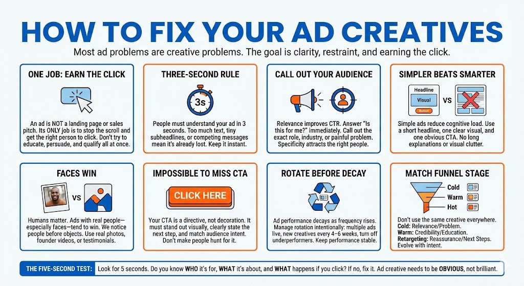
Your Ad Has One Job: Earn the Click
An ad is not a landing page. It’s not a sales pitch. It’s not a product tour.
The only job of an ad is to stop the scroll and earn the click from the right person. When ads try to educate, persuade, and qualify all at once, they usually fail at all three.
.jpg)
One of the most common issues we saw was ads packed with too much text. Subheadlines no one can read. Multiple messages competing for attention. Tiny CTAs tucked into corners.
As I said on the call, “People need to understand your ad in three seconds. If they can’t, it’s not working.”
If your ad requires effort to interpret, it’s already lost.
Make It Obvious Who the Ad Is For
The fastest way to improve click-through rate is not better design. It’s relevance.
Many ads we reviewed were technically fine, but they never answered the subconscious question every viewer asks immediately: Is this for me?
Generic headlines like “Unlock better results” or “Transform your workflow” don’t repel the wrong people, but they don’t attract the right ones either. Specificity does both.
Your best-performing ads will usually do at least one of the following right in the headline or visual:
- Call out the exact role (CEO, Head of HR, IT Director, RevOps)
- Call out the industry or vertical
- Call out a painfully familiar problem
When someone recognizes themselves in the ad, they click. When they don’t, they scroll.
As we discussed live, “The first thing people look for isn’t how good your product is. It’s whether the ad is speaking to them.”
Simpler Ads Beat Smarter Ads
There’s a strong temptation to make ads feel clever or comprehensive. In B2B especially, teams want to prove credibility immediately.
But what we’ve seen consistently is that simple ads outperform complex ones, especially in prospecting and retargeting.
Some of the best-performing ads we run — and reviewed — are almost boring:
- A short headline
- One clear visual
- One obvious CTA
No long explanations. No tiny subtext. No visual clutter.
.jpg)
David made this point clearly during the session: “A lot of times, the stupid simple ads outperform everything else.”
That’s not an accident. Simple ads reduce cognitive load and make the decision easy.
Humans Still Matter (A Lot)
Another pattern that came up repeatedly was the difference between ads with people and ads without them.
Logos, dashboards, and abstract graphics have their place. But across Meta and LinkedIn in particular, ads with real humans — especially faces — tend to win.
Not because they’re more informative, but because we’re wired to notice people before objects.
If you’re not already testing human-centered creatives, you should be. That includes:
- Photos of real people, not stock where possible
- Founder videos shot on an iPhone
- Customer testimonials with a face attached
As we mentioned on the call, “We’re social mammals. Faces pull attention faster than screenshots.”
You don’t need high production value. You need authenticity and clarity.
Your CTA Should Be Impossible to Miss
CTA problems were everywhere in the live reviews.
Buttons that were too small. Buttons that blended into the background. CTAs that said “Learn More” without telling you what you’d actually learn.
Your CTA is not decoration. It’s a directive.
A good ad CTA does three things at once: it stands out visually, it clearly states the next step, and it matches the intent of the audience.
For colder audiences, softer CTAs usually perform better. For warmer audiences, stronger CTAs are appropriate.
The key is alignment, not aggression.
As I said during one review, “If I have to hunt for the CTA, the ad is already broken.”
Rotate Creative Before Performance Drops
Ad creative doesn’t fail all at once. It decays.
.jpg)
Click-through rates slowly decline as the same people see the same ad over and over again. This is especially true for retargeting and matched audience ads.
One of the easiest ways to improve performance without touching budgets is to manage creative rotation intentionally.
A healthy creative system usually looks like this:
- Multiple ads live per ad set (not one “winner”)
- New creatives added every 4–6 weeks
- Underperformers turned off instead of endlessly tweaked
This keeps performance stable as you scale and prevents sudden drops that feel mysterious but aren’t.
As David put it, “If your CTR drops below 0.5%, your ads are probably stale.”
Match the Creative to the Funnel Stage
Another common mistake is using the same creative everywhere.
Cold audiences, warm audiences, and hot audiences respond to different messages. When the same ad is shown to all of them, it underperforms across the board.
Creative should evolve with intent:
- Cold ads focus on relevance and problem recognition
- Warm ads focus on credibility and education
- Retargeting ads focus on reassurance and next steps
Trying to jump straight to demos or sales calls with cold creative is one of the fastest ways to inflate CPL.
As we discussed, “People don’t book calls from ads until they trust you. Creative is how you build that trust.”
The Five-Second Test for Ad Creative
Here’s a simple test I use constantly.
Look at your ad for five seconds. Then ask yourself:
- Do I know who this is for?
- Do I know what it’s about?
- Do I know what happens if I click?
If the answer to any of those is no, the ad needs work.
Fixing ad creative is rarely about making it prettier. It’s about making it clearer.
Final Thought
Ad creative doesn’t need to be brilliant. It needs to be obvious.
Most SaaS companies don’t lose because their ads are bad. They lose because their ads are trying too hard to do too much.
Strip it down. Make it specific. Make the CTA clear. Rotate before fatigue sets in. And remember what I said on the call: “Your ad isn’t there to sell your product. It’s there to earn the click.”
When you get that right, everything else downstream gets easier.